AMO
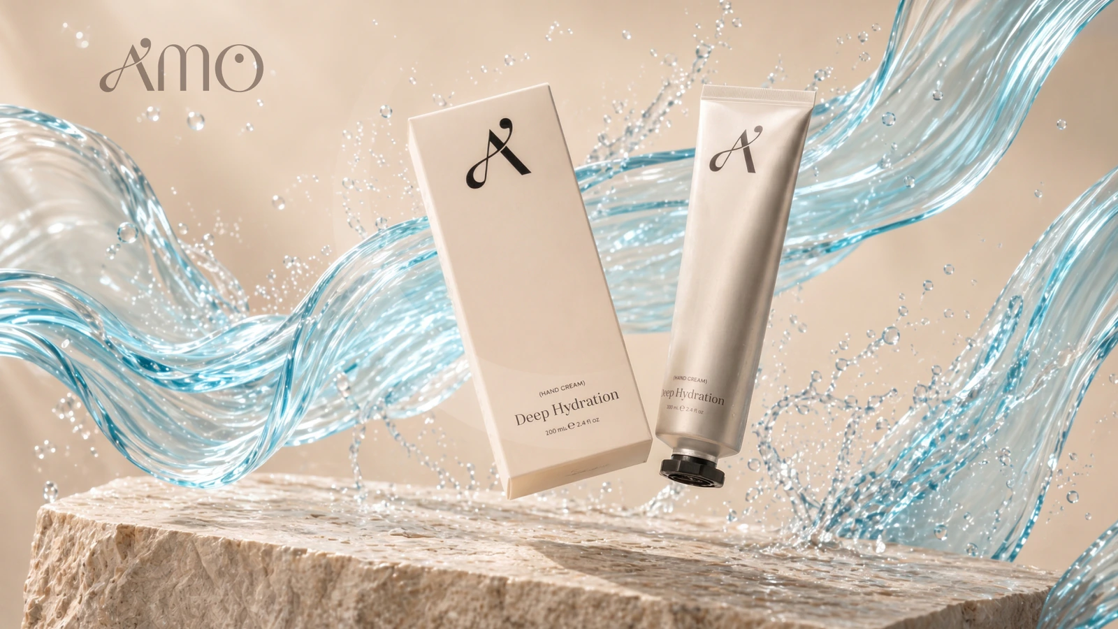
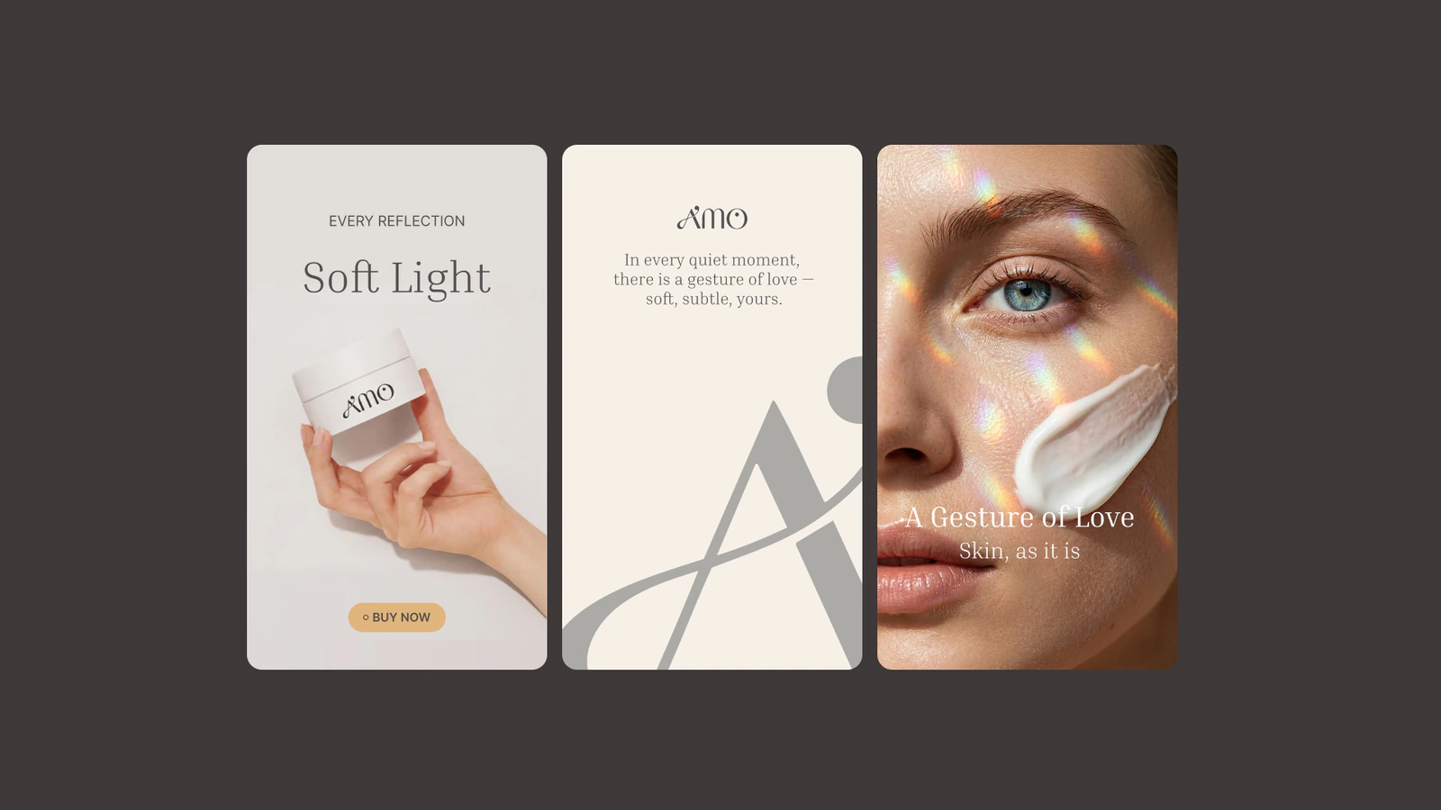
Branding for the launch presentation of a cosmetics line.
Brief
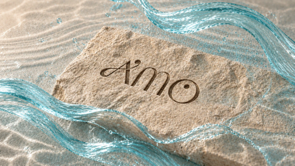
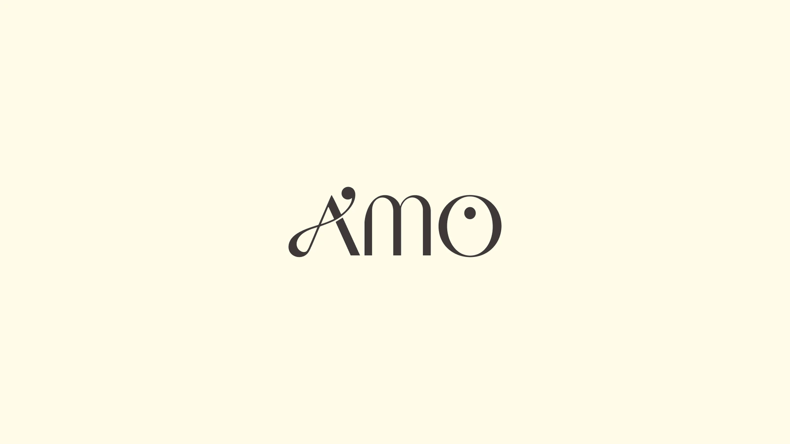
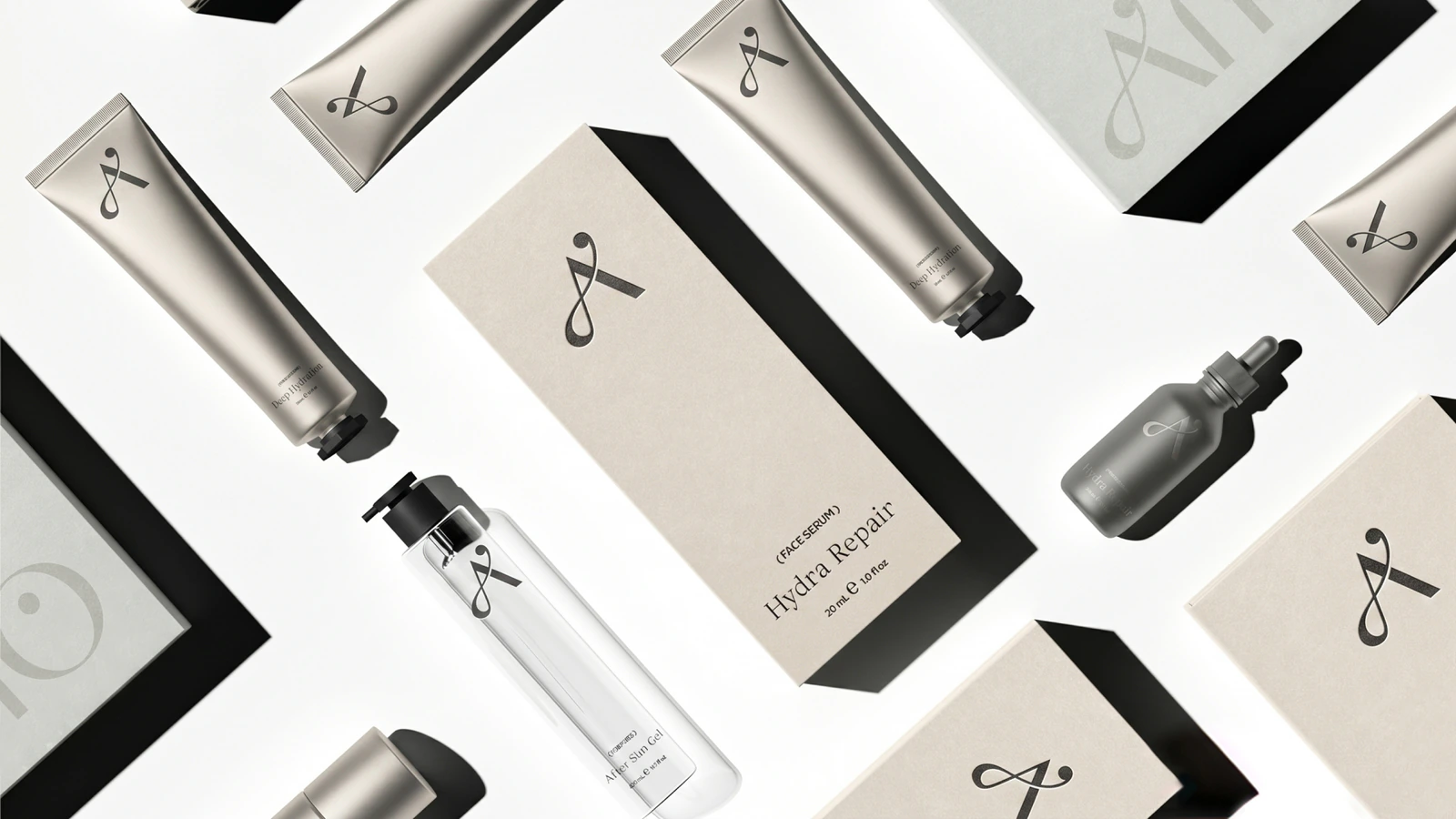
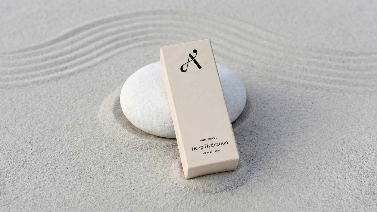
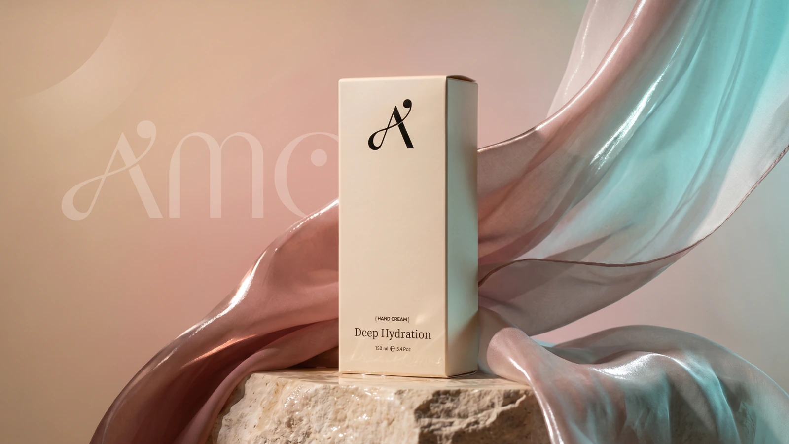
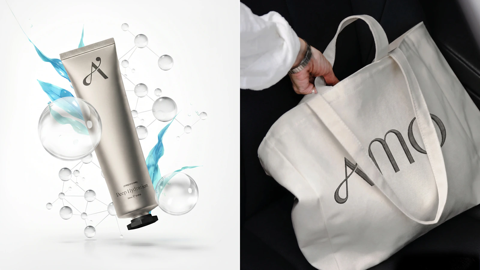
The cosmetics brand needed a system that reads as calm. The difficulty with packaging is that one mark has to work equally well in every application: embossed on metal, printed on cardboard and on fabric.
Solution
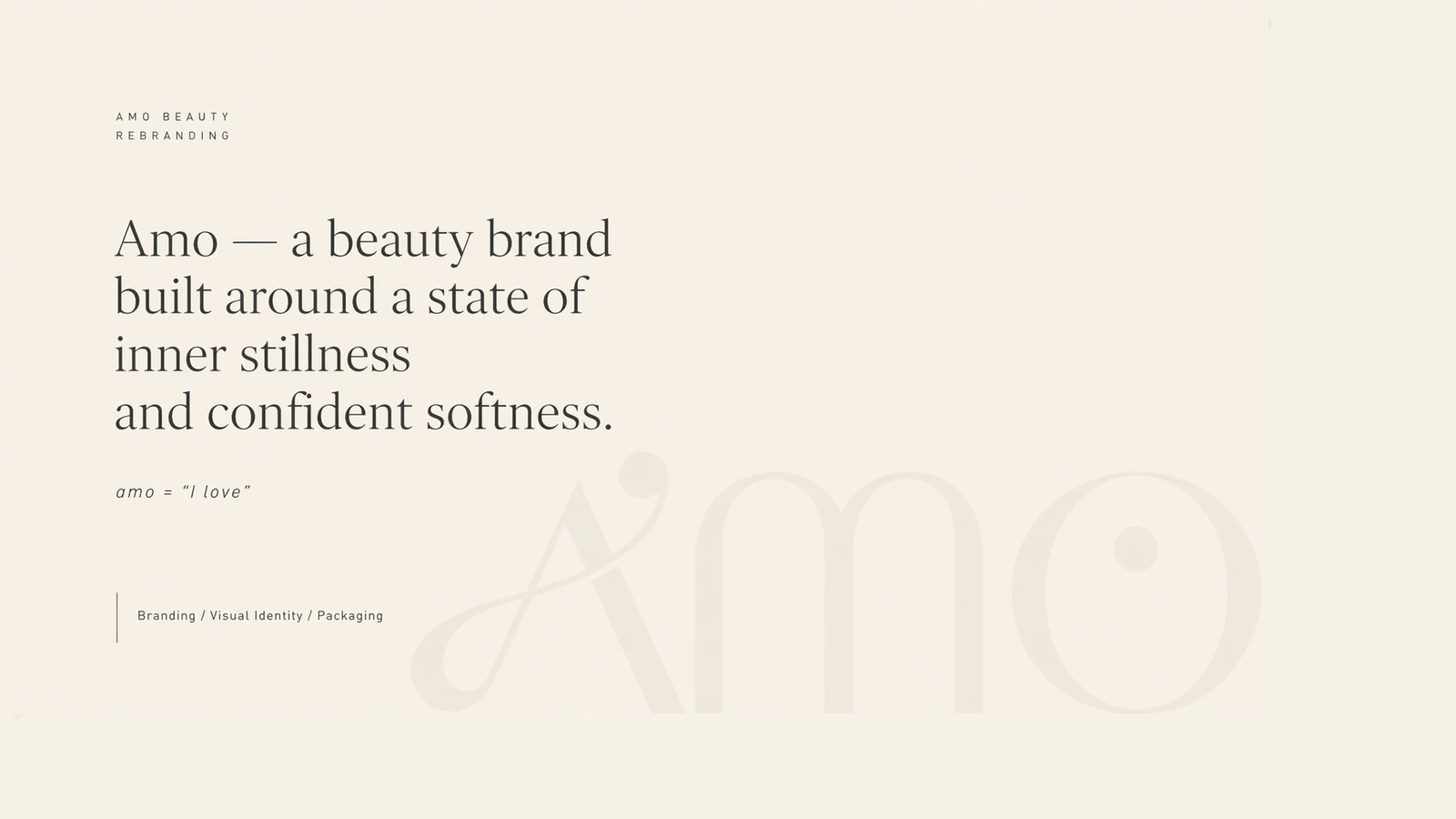
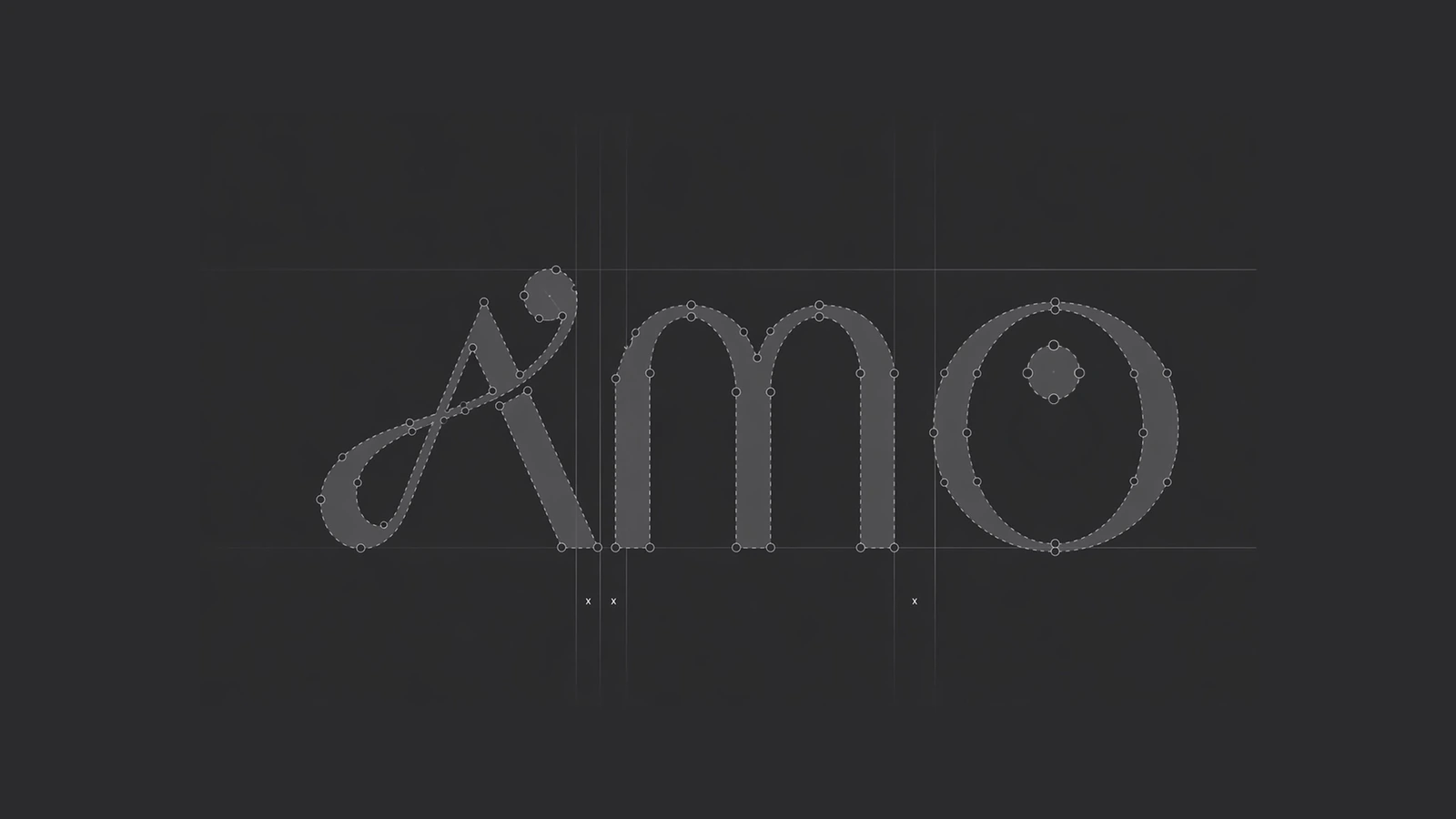
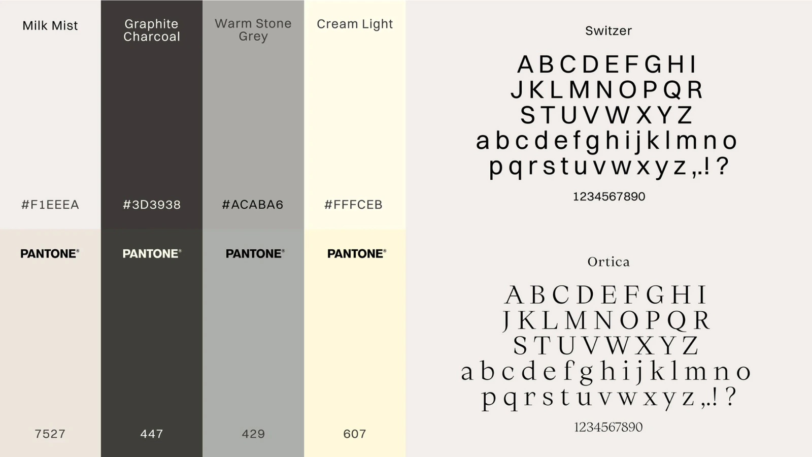
The mark is built as an A-m-o ligature on a defined geometry and grid, so it scales without losing character. The palette is four warm neutrals from cream to graphite, each with a Pantone number for print. Typography is two typefaces: the grotesque Switzer and the serif Ortica. The system is deliberately plain: muted colour, plenty of air.
More projects
 BrandIllustrationAI-assisted visuals
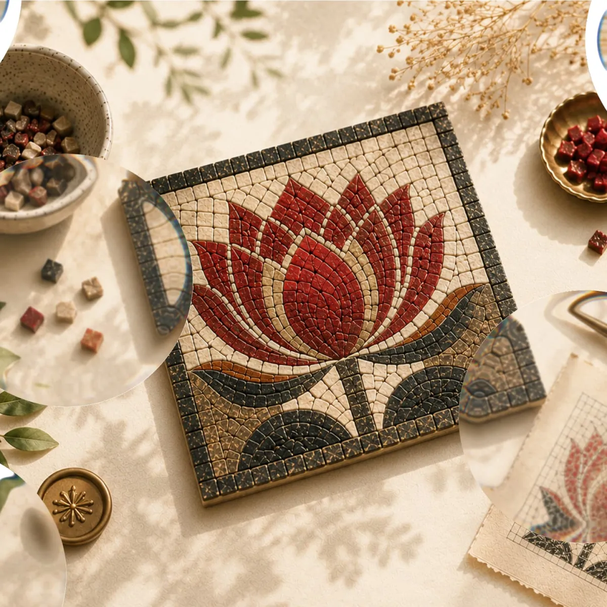
Visual Brand Identity
A set of illustrations for a marketplace of handmade goods.
15images in the visual system
 Product & UX/UIBrandMobile app
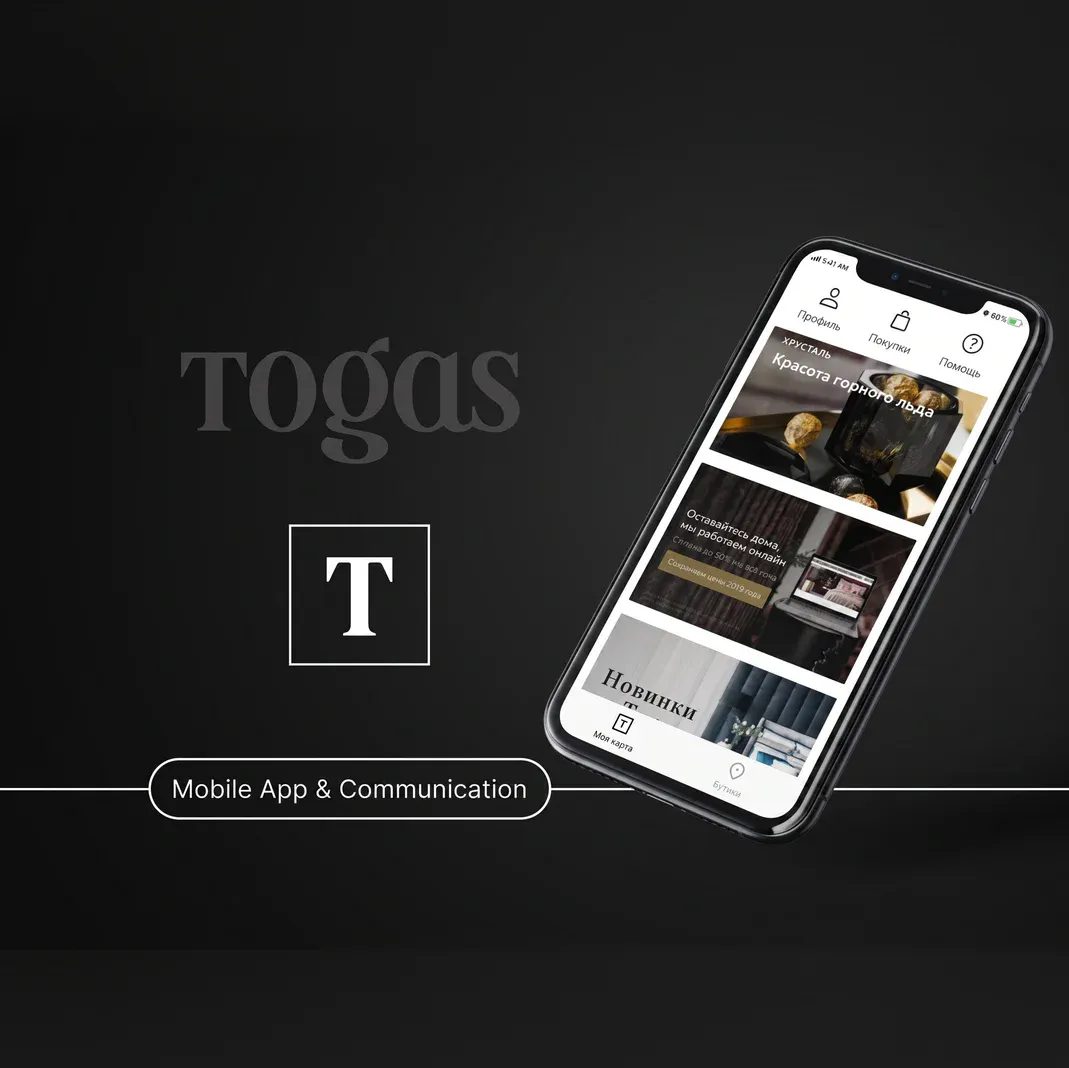
Togas App
Mobile app for a premium sleep-products boutique: catalogue, cart, checkout, loyalty and a store locator.
+25%in orders