
Fora
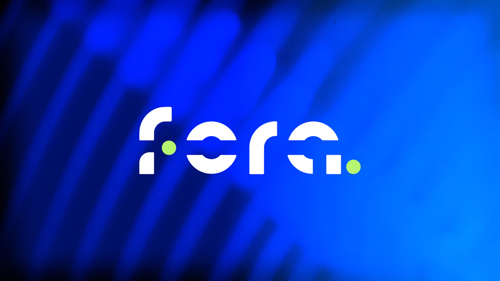
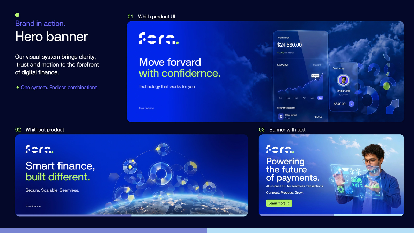
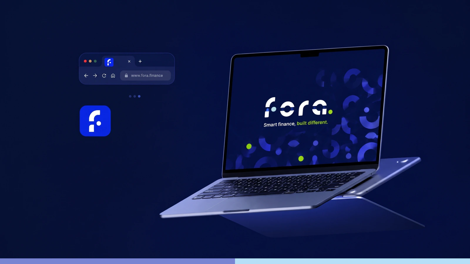
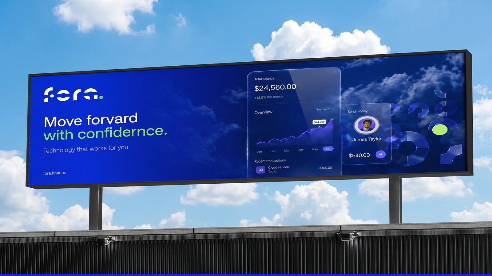
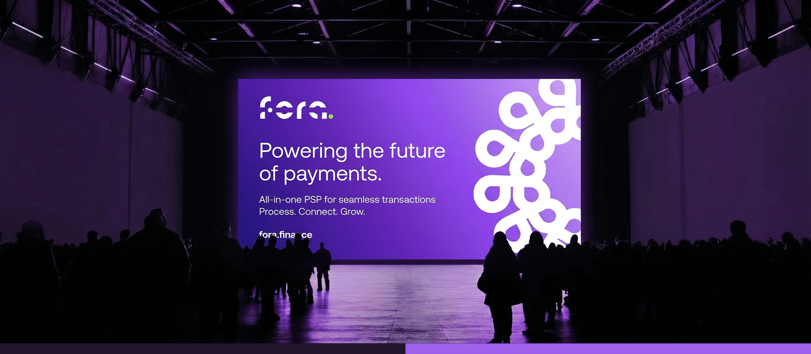
Branding for a payment service (fintech startup): logomark, colour and type system, modular pattern.
Brief
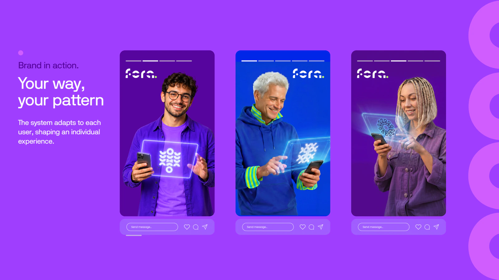
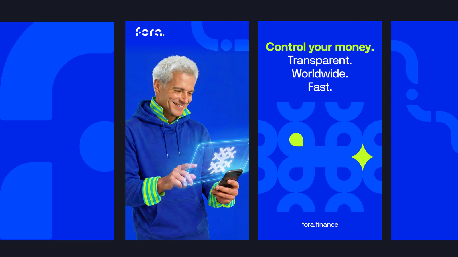
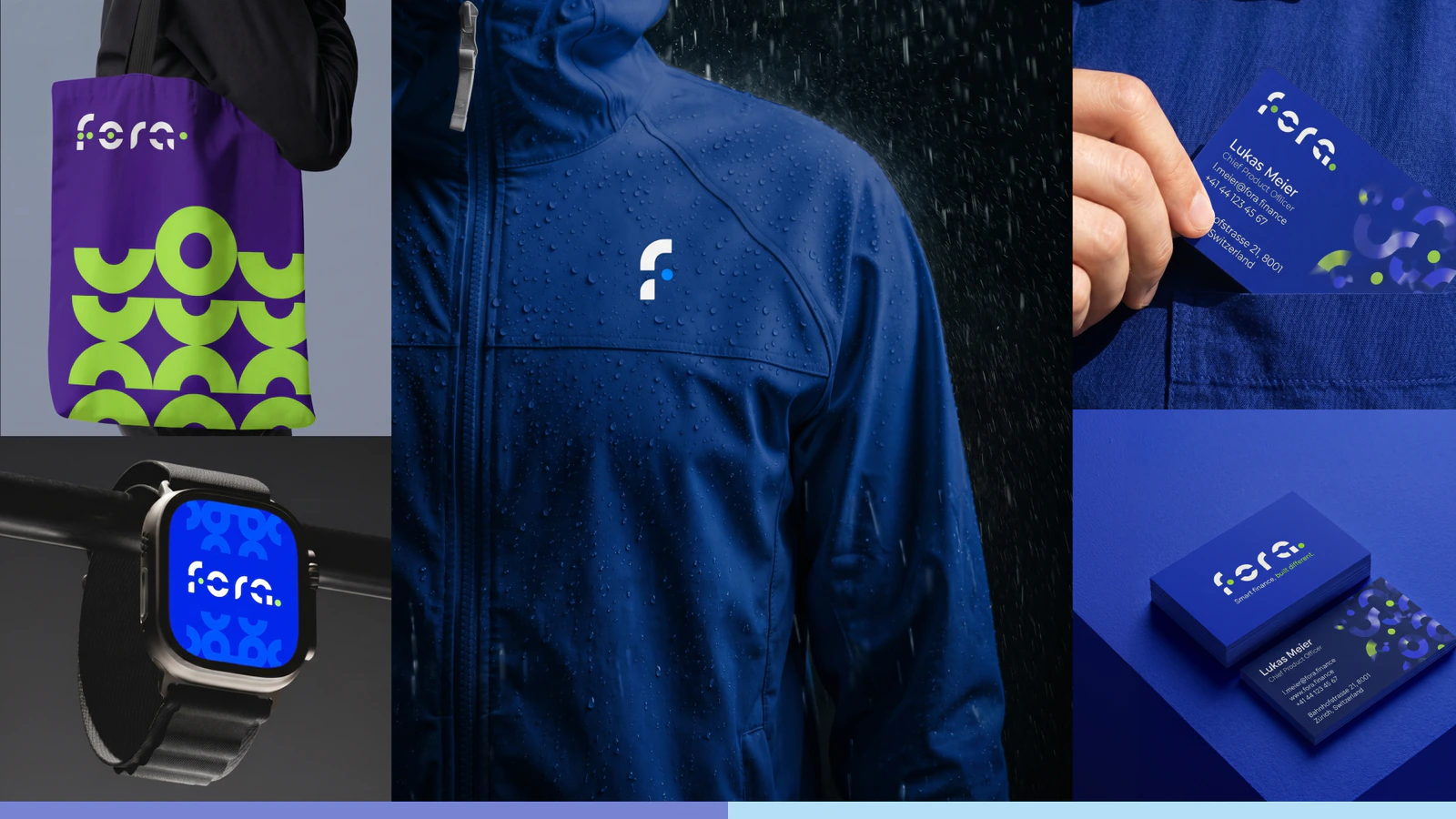
Build an identity for a payment service handling both conventional and crypto payments. One system had to stretch from an app icon to a billboard without falling apart.
Solution
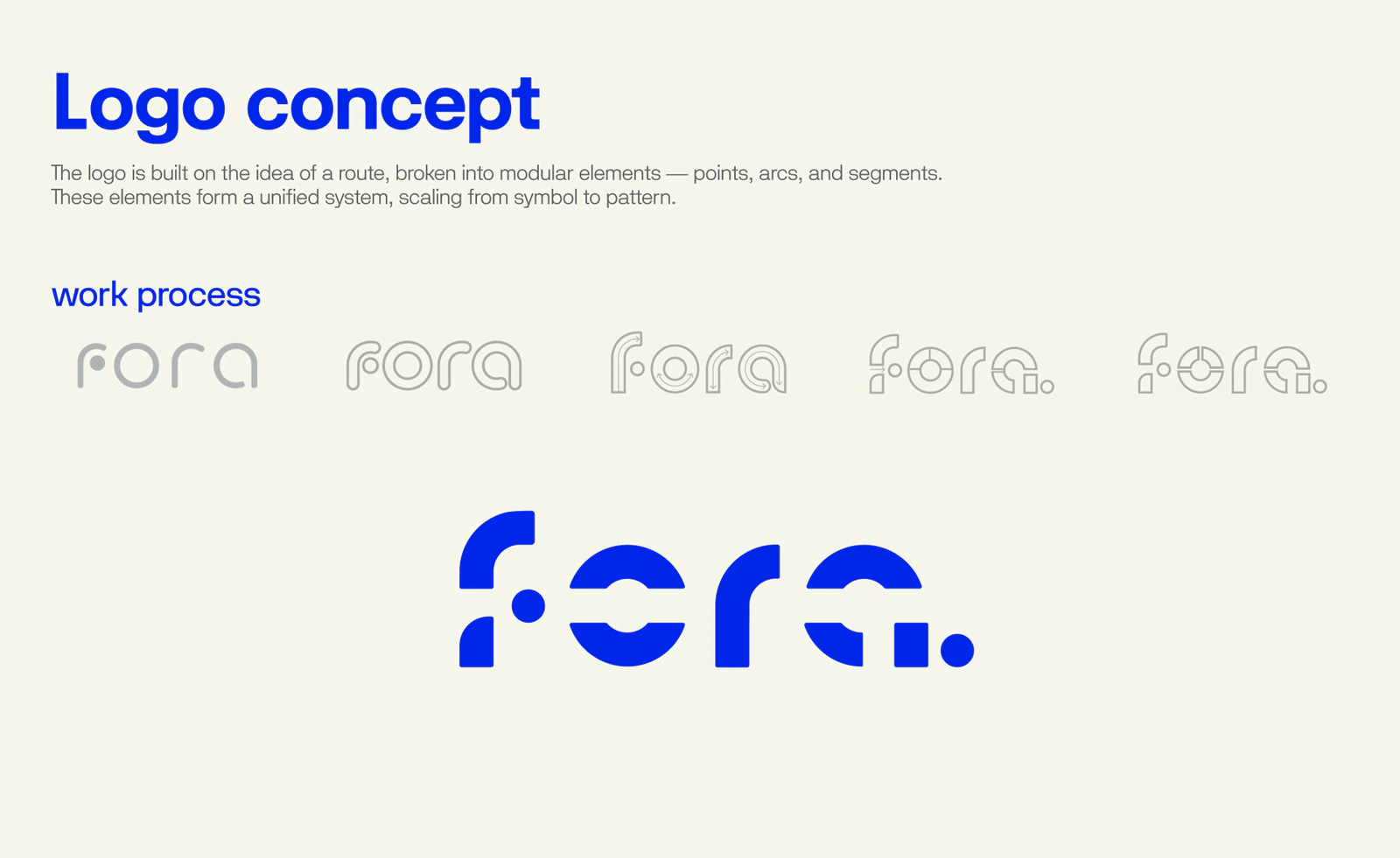
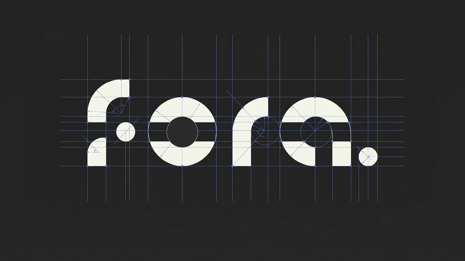
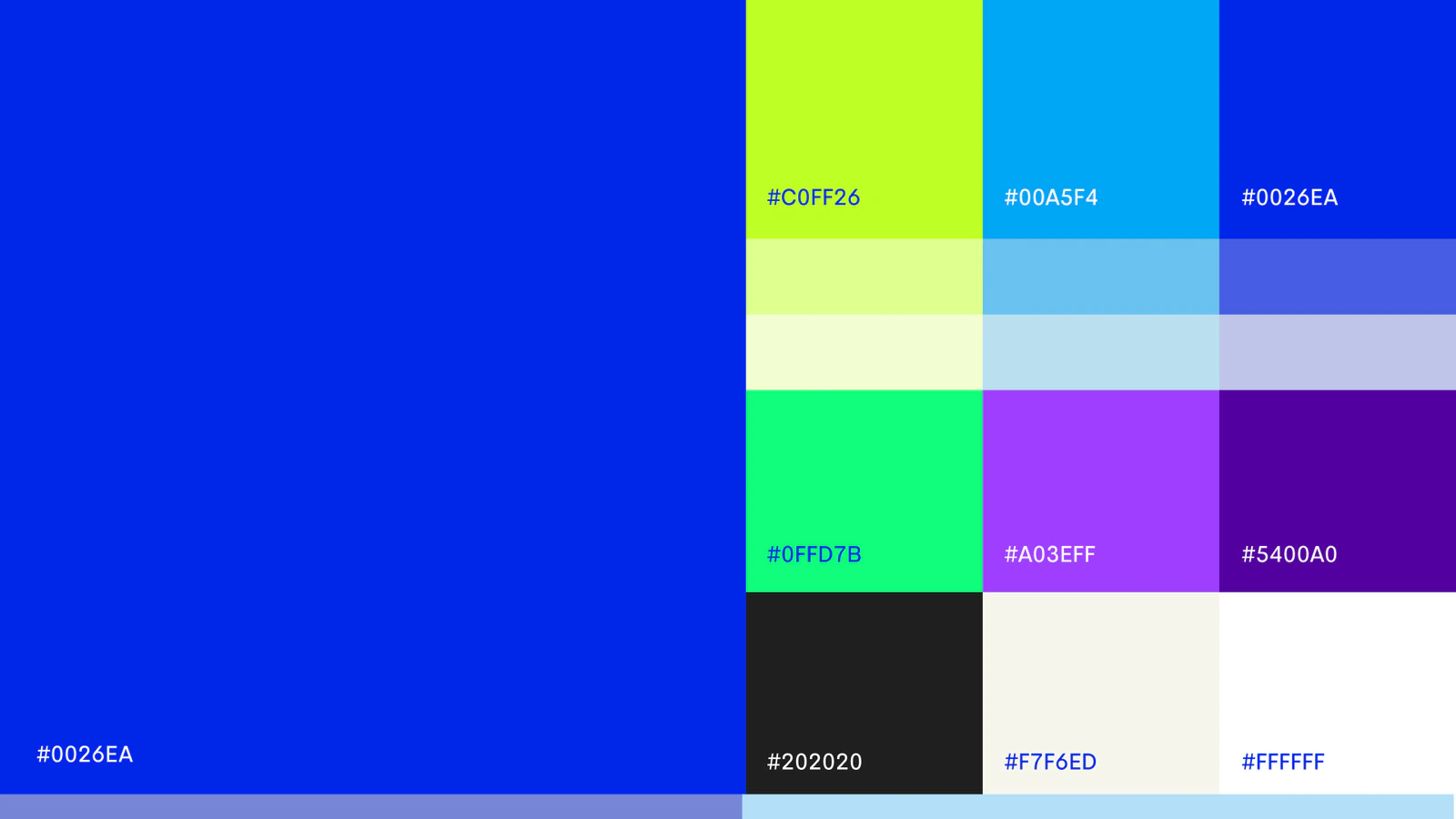
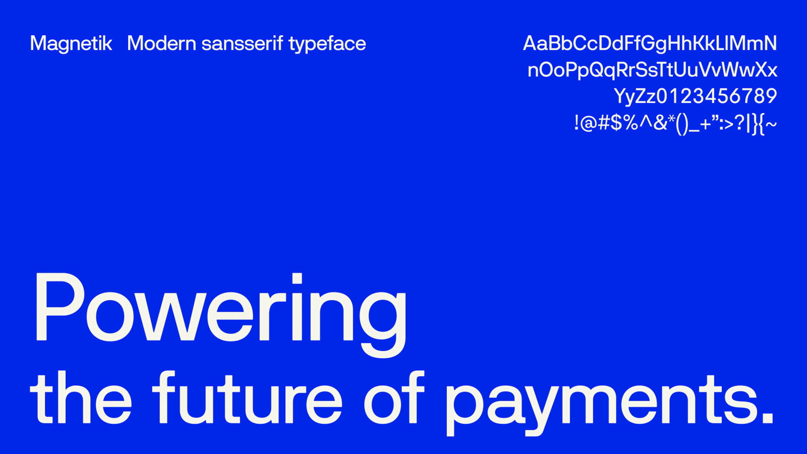
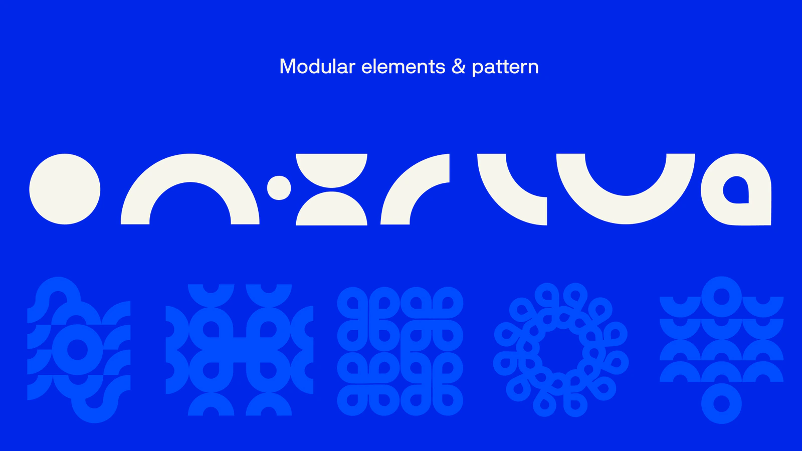
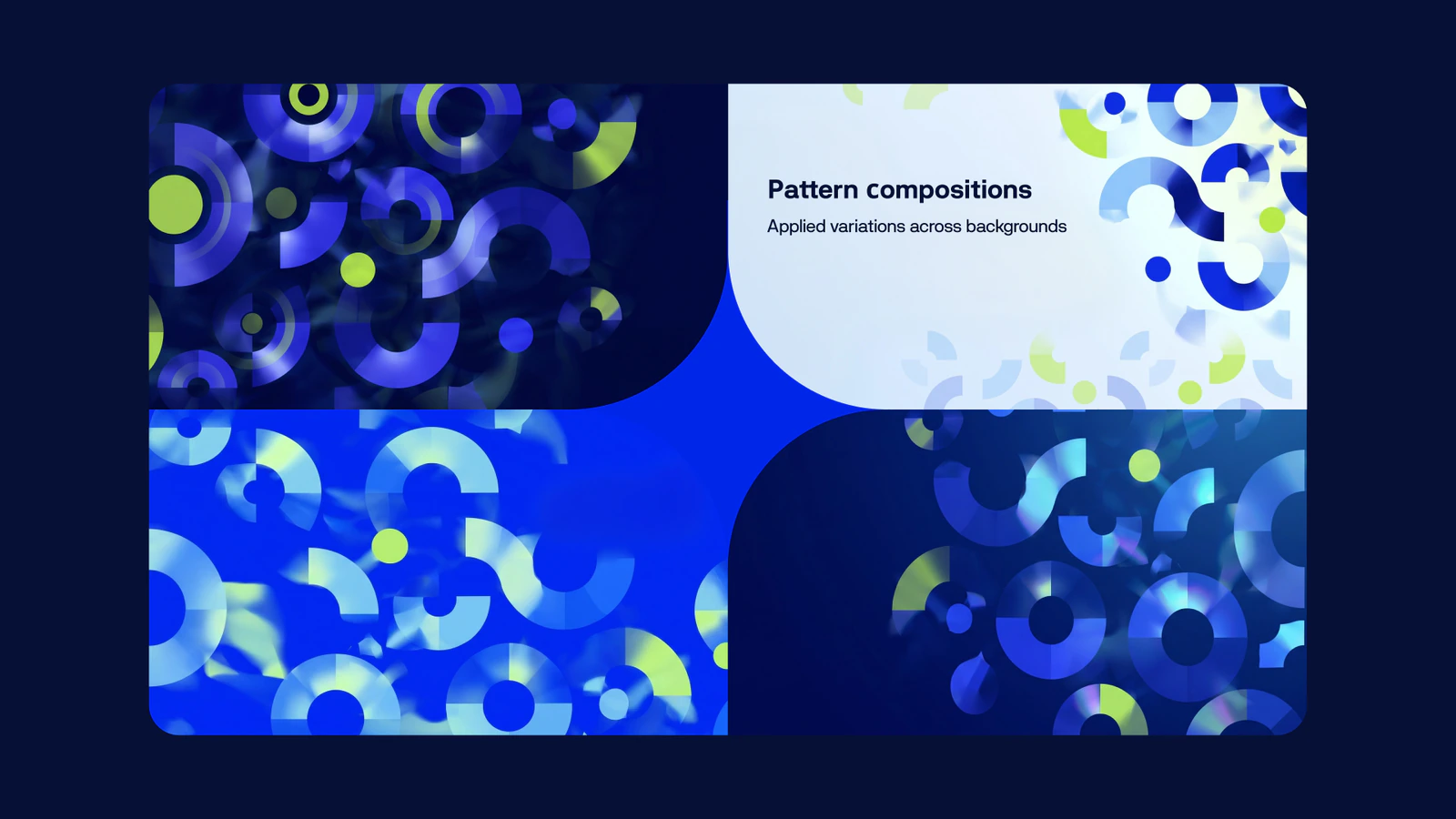
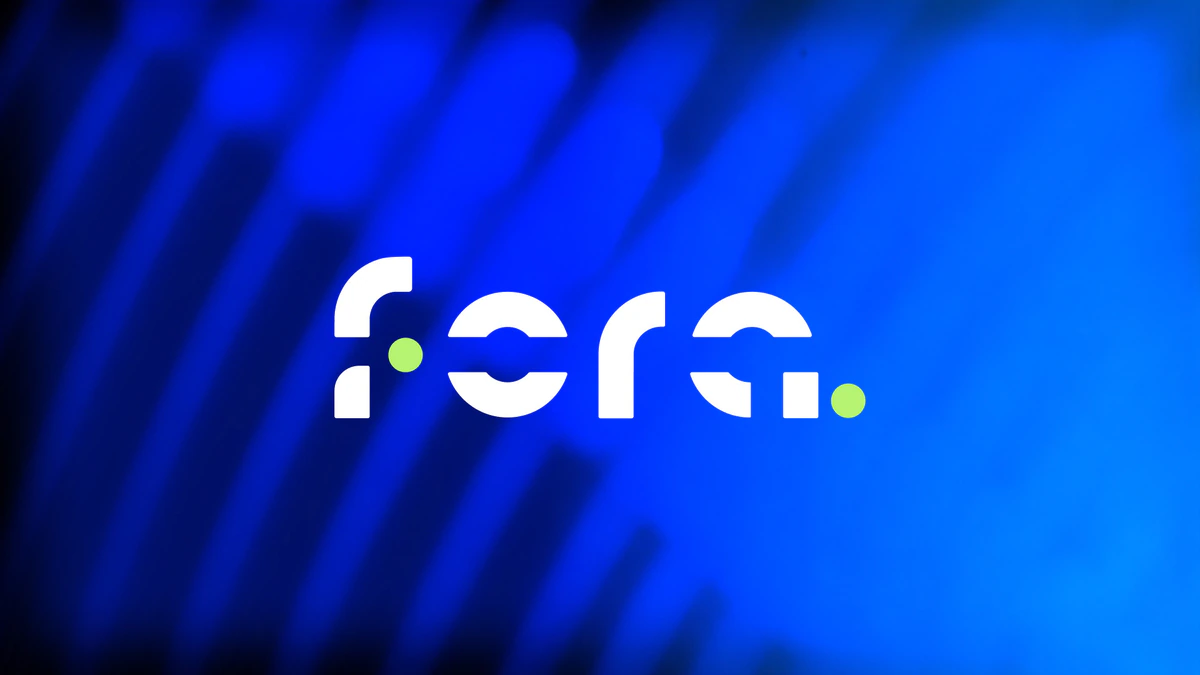
The mark is built from the idea of a route: points, arcs and segments. The pattern grows from the same elements, so the brand scales without new entities. A saturated palette and Magnetik give fintech a voice that sounds confident rather than cold.